I could write a witty introduction but I won’t. Who reads blogs anyway? Blogs are like Playboy. No one really reads them. People just want to see the pictures. So………
1. I don’t like to see a bunch of unused appliances out on the counter tops as decoration. Instead, I would rather see baskets, plants, cutting boards, and vintage tins for storage. Pack up that crusty old Cuisinart and put it behind closed doors. When was the last time you used it anyway? Donate it.
ps – The chopping block island is perfect as a kitchen table.

2. This kitchen is less accessorized, but it works because some of the upper cabinet doors are glass. I like the utensils and oils above the stove. I have that setup, too, and it is so handy. The toaster in the corner is ok as I am sure it gets action in the mornings and something like that needs to be convenient.

3. This kitchen is interesting because the cabinetry is very modern but they are juxtaposed against an industrial brick wall and accessorized with antiques. The balance is nice. The chalk board propped up on the counter is useful, too.

4. I like how the stuffed glass fronted cabinets are next to the simple glass jar on the capital pedestal. I also like how the coffee maker is inside it’s garage. Coffee makers are messy.

5. I like the large plants in the windows. They soften this otherwise sparse kitchen. I also love the wine storage on the left. It looks like a bottle dryer (similar ones can be found in NapaStyle catalog) propped up against the wall. Great idea!

6. This photo is from Coastal Living. Another sparse kitchen, but the tile wall makes up for it! I like this trend.

7. I love you, but I can’t live like this anymore. You’re just so vacant! It’s like nobody’s home. Oh, sorry, I was speaking to the kitchen. Obviously this person eats out a lot.

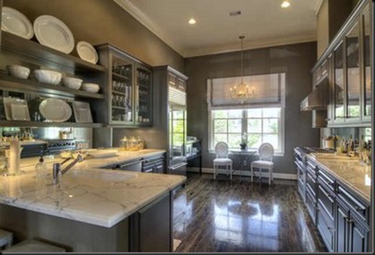
8. The next two photos are from La Dolce Vita. I am a sucker for glass fronted refrigerators. I just love them. This is a beautiful kitchen. I love the dark shades of gray. The counter tops are free from clutter but the cabinets and open shelving are packed with interesting dishes, etc.


9. Another tiled wall – like this. Open shelves – like. Accessories – LOVE! Herbs, cutting boards, utensils, cookbooks, toaster, microwave, canisters, all gooood!

10. This black and white floor is fabulous! It fills up the space so not as many accessories are required. I like the collection of wine jugs on the table.

photo – Things That Inspire
11. Loooove the dark stained floors! This photo is from Cote de Texas – one of my favorite blogs. I’ve said this before – I love the light blue and red combination. WOW!

12. This chalkboard is a nice touch. Is it a door conversion? Not sure.

13. Great accessorizing here…topiaries, fruit on a tiered pedestal, vintage bread tin, glass cloche, upright mixer, and bottles of Pellegrino. Love the black cabinets, the white drum shades and the simple window treatment. Oh – and don’t forget the great rug!

14. First of all, the black framed windows and doors really make this space special. The chandeliers are perfect and the long wooden table is too fabulous! Notice how the cabinets are more modern with the long handles. Accessories – artichokes, upright mixer, flowers, art, and oils.

photo – Southern Accents
15. Another big trend – shelves instead of upper cabinets. Accessories – dishes and glassware, potted herbs, toaster, flowers, vintage tins, canisters, a bucket filled with green apples, and a little shelf (?). Not sure if it is a shelf, but it is so cute!

16. Another wooden kitchen table against a white backdrop AND more black framed doors! The chandelier and the sconce in this space are lovely. This could be accessorized for Christmas with all the red fruit on the table. Grandma’s old crystal and sterling are suddenly chic when grouped together.

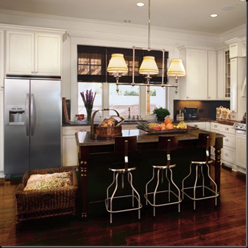
17. This is a Southern Living kitchen. I included it because the accessories are more practical. The chips are stored in plain view on the island and it’s ok because they are in a decorative wooden basket. The dark shades on the windows balance out the dark shades of the island and the granite. The dog bed is cute and I would have no problem having it in the kitchen but I know a few germaphobes who would probably protest.

18. I like the LARGE accessories in this kitchen. The lemon tree in the urn is pretty and the basket of rosemary is also pretty. I know fake plants are a no-no but would it be bad to wire a couple of fake lemons on the lemon tree when the real ones drop?

photo – Southern Accents
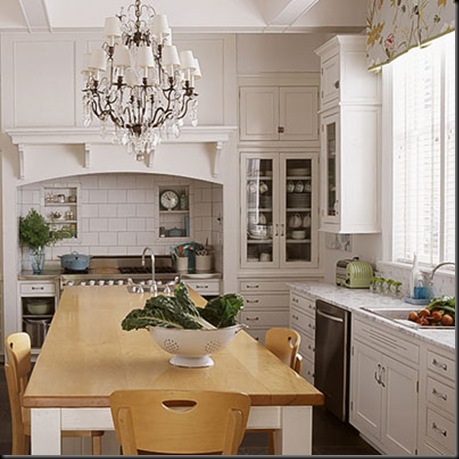
19. Another pretty chandelier. I like the niches over the stove. They are perfect for small items like toothpicks and salt and pepper, etc. There is a sink in this kitchen table – nice.

photo – Southern Accents
20. Ok – this kitchen has the best accessory so far – the taxidermy hog. I need one of these. It would go well in my kitchen – not kidding. I’ll have to check eBay…

photo – Southern Accents
21. Gwenyth Paltrow’s kitchen – love the black cabinets and the chandeliers. I see a lot of appliances on the countertops. Accessories could be better – Gwen. I like the basket of veggies on the island. Those were probably thrown in for the photo shoot.

22. And finally, a Windsor Smith kitchen that has been all over the blogs. I loooooove this kitchen. I love the useful accessories. I love the marble topped table and the trellis chairs and the wingbacks. It’s just perfect. The vase of flowers is a pretty centerpiece and the black and white floors add a lot of visual weight to the mostly white room. Oh – I just noticed that the chairs have black vinyl cushions! Yummy!


