I am so glad that warm weather is finally here! It seems like it has been the looooongest winter. I know, I am spoiled, because winter is hardly winter in Florida. But still, it has been cooler than usual, I think.
These images of outdoor spaces are so inspiring to me. There are do-able ideas in every photo. I love the awning and drapes in this photo. Look how they painted the wicker wing chairs two different colors. The stripe of white along the top pulls from the white on the seat cover. This setting looks so inviting.

photo via BlissMe
Gorgeous...A handy person could easily copy this cabana. The construction looks simple. Notice how there is space between each wooden slat, this allows for air flow. A cabana like this wouldn't have to go near a pool. It could go out in a pretty yard, sans the pool, for just a nice place to relax or take a nap. Also notice how the groups of lounges are placed close together instead of spread out. Together, they make a statement.
 photo via BlissMe
 What a neat mural in the background! By painting the planters bright blue, it gives this area a WOW factor. Elevating them on the rough, wooden pedestals also adds drama.
 photo via BlissMe
 I wonder if this could be re-created using a ready made tent? Probably. The stripes are the key to this look. They lend a yacht-y feel. Lanterns like these are all over eBay. The round tables counter all the lines in the space and echo the round lanterns above. It's all about balance.


photo via BlissMe
Another photo pulled from Cote de Texas... What makes this spot so great? The HUGE palms. This photo would have fallen flat had there been two dinky plants flanking the settee. The visual weight of the plants balance the busy-ness of the tiles, etc. They act as ANCHORS. I am a believer in LARGE plants, indoors and out. If you can't afford large plants, at least group your small ones together. Nothing is worse than a lone, little plant. Another idea from this photo is the way they draped the blanket over the center of the settee. If they had not done so, there would have been too much white in the settee and it would have competed with the white walls. The blanket breaks up the white.
 photo via Cote de Texas
 photo via Cote de Texas
OK - there are no huge plants in this space, but they DID group the small ones together to create visual weight. My point exactly. Notice how the tile top of the table pulls all the colors from the flowers and the pillows on the bench. If the table had been all white, there would have been an imbalance in the space. If you can't do a tile table top, why not fake it with paint?

 photo via La Dolce Vita

photo via PointClickHome
This outdoor spot is serene and clean. Again, the Moravian star lighting can easily be found on eBay and is not that expensive. The wood trellis is an easy project. It echoes the color of the teak furniture. There is a pattern here, BALANCE. Side note - I have teak furniture around my pool and it is a BITCH to keep up. Unless you enjoy cleaning and oiling, stay away from teak. I have decided to let mine go gray - Hampton's style.
 photo via La Dolce Vita
This looks more like the color of my teak at the moment. I love this large table. It looks very user friendly. Keep in mind, though, that the reason this table works is that there is plenty of green in the background. If the table sat on white concrete with little landscaping around it, the glaring, white would blind you.


photo via My Home Ideas
More graying teak...beautiful. Another beautiful Moroccan lantern. If wiring is not an option, just put a huge candle inside. Love, love, love the landscaping.


photo via MyHomeIdeas
The Moroccan lantern can make any space look special. See, candles inside, not light bulbs...
photo via MyHomeIdeas
The simple trellis in this photo is definitely a DIY project. It works against the heavily wooded background. Outdoor, propylene rugs, like this one, are a great invention. They are inexpensive and beautiful.
photo via MyHomeIdeas
WOW - this furniture is gorgeous! The structure is simple, yet the furniture is very ornate and it works. It appears that the inside of the loggia is painted a light blue - SO PRETTY!
Big impact can be made in small spaces. The HUGE plants soften the corners in this space.
 Lots of small plants soften the corners in this space. The large stone carving makes the statement here.
 photo via MyHomeIdeas
Concrete floor? Paint it! Concrete is easy to paint. This pattern looks simple. Tape it off and start rolling! Just be sure to choose subdued colors so as not to make the floor the main attraction. If it becomes the main attraction, all of your painting flaws will be center stage.

The bright colors work in this photo because every thing else in the space is white and subdued. The only color comes from the green painted, glass doors, the large plants in the corner, the pillows, and the furniture. I love using fabric curtain panels outdoors. An inexpensive alternative to custom , outdoor panels is to buy ready made, white panels from Pottery Barn. I washed mine before installing them because they shrink when washed. Now when they get dingy, mildew-y, or dirty I can throw them in the wash with a little bleach and they come out like new.

 Lots of small plants soften the corners in this space. The large stone carving makes the statement here.
 photo via MyHomeIdeas
Concrete floor? Paint it! Concrete is easy to paint. This pattern looks simple. Tape it off and start rolling! Just be sure to choose subdued colors so as not to make the floor the main attraction. If it becomes the main attraction, all of your painting flaws will be center stage.
The bright colors work in this photo because every thing else in the space is white and subdued. The only color comes from the green painted, glass doors, the large plants in the corner, the pillows, and the furniture. I love using fabric curtain panels outdoors. An inexpensive alternative to custom , outdoor panels is to buy ready made, white panels from Pottery Barn. I washed mine before installing them because they shrink when washed. Now when they get dingy, mildew-y, or dirty I can throw them in the wash with a little bleach and they come out like new.
photo via Cottage Living
All of these outdoor rooms have something in common, they are INVITING! They make you want to go outside and enjoy the fresh air instead of plopping in front of the television. Make your outdoor space a place for YOU to enjoy, don't save it just for entertaining. Have breakfast out there, sort the mail out there, talk on the phone out there, do WHATEVER out there, just get out there and enjoy!


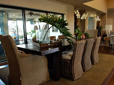

 I love the huge bird print as well as the large planters. The scale of this room is nice.
  This area is located on the back side of the foyer wall. Through the door is the master bedroom. This room doesn't do much for me. I do like the matching mirrors and tables in the background, though.
  I like the wall of tile in the kitchen and the long, dark cabinets.


 The child's room is bright and cheery and TINY! Cute bed, but I hope she doesn't have plans for sleepovers...


 This is the sitting room. I heard on the news this morning that there are over a million alligators in Florida. Because of the drought, they are more active than usual right now, so dog walkers and joggers - BEWARE!! I digress...
 The master bedroom is soothing in soft blue and the turquoise keeps it from being boring. I like how they swept the drapery panels to either side of the windows.


