The exterior of the home features native, low maintenance, and drought tolerant landscaping. The home has wide overhangs for optimal cooling. On the website there are photos of the vegetable garden in the back yard along with the compost and the rainwater collection systems.

I like how they showcased this pop of color in the foyer.

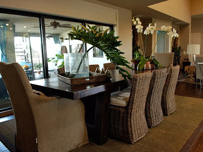
The dining area is open to the living room and also opens up to the back porch.

Another shot of the dining area...
 I like the color combination in this lounge area. The orange really pops against the dark cabinets. There are two beverage refrigerators on either end of the long cabinet. This area could definitely be used as a bar for entertaining.
 I love the huge bird print as well as the large planters. The scale of this room is nice.
  This area is located on the back side of the foyer wall. Through the door is the master bedroom. This room doesn't do much for me. I do like the matching mirrors and tables in the background, though.
  I like the wall of tile in the kitchen and the long, dark cabinets.
 I like the hood above the stove. It makes the less expensive appliances look beefier. I would rather have seen a glass top range with a separate built in oven below. I found out not long ago that, overall, electric ranges are more energy efficient than gas. That is probably why they chose to use electric appliances instead of gas in this "green" home.
 I noticed a neat design trick. Look at the door to the pantry. See how they added a false transom to the top of it to make it seem taller? It looks more substantial than a simple door. Now, go back to the dining room photos. They did the same thing on the sliding doors.
 Nice colors in the guest room. I like the fabric covered bedside tables. All kinds of things can be hidden behind the fabric. The glass on top protects the fabric from stains. This is a low cost decorating idea.
 The child's room is bright and cheery and TINY! Cute bed, but I hope she doesn't have plans for sleepovers...
The children's bathroom is nice. I like more mirror space, though. Maybe it would have been better to place this mirror on top of a mirrored wall?

I like the lines of tile in the bathtub/shower area and the super, soft pink walls.

This bathroom is the hall bathroom. I love the tiled wall. Since this bathroom will be used more as a powder room, the small mirror doesn't really matter. I like the brown and blue combination.

 This is the sitting room. I heard on the news this morning that there are over a million alligators in Florida. Because of the drought, they are more active than usual right now, so dog walkers and joggers - BEWARE!! I digress...
Anyhoo- nice gator prints on the wall.
 The master bedroom is soothing in soft blue and the turquoise keeps it from being boring. I like how they swept the drapery panels to either side of the windows.
 The master bedroom is soothing in soft blue and the turquoise keeps it from being boring. I like how they swept the drapery panels to either side of the windows.


1 comment:
ridiculously beautiful..typically designers pick on conservative colors/themes in order to look elegant. This is daringly colorful yet stunningly beautiful!
Post a Comment